Branding
Graphic Design
Academy Food Co. Branding
30 May 2024

A Multi-Faceted Rebrand
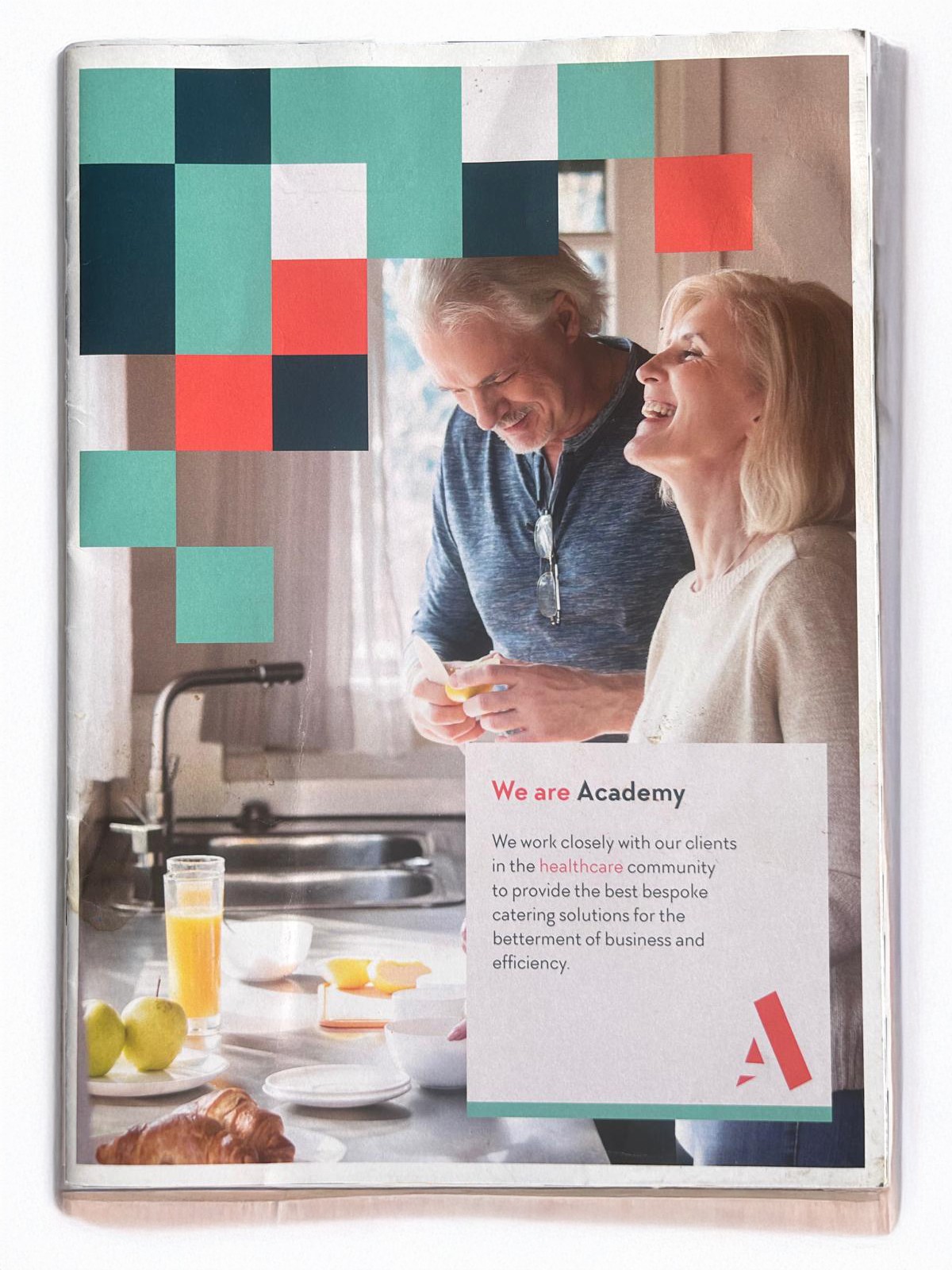
This rebrand was a particularly intricate undertaking, demanding a multi-faceted approach to align with various sectors within a company boasting an annual turnover in the millions of pounds. While an earlier, simpler brand identity provided a starting point—one that was significantly less developed and not specifically designed to cater visually to diverse sectors like education and healthcare. My focus was on shaping this initial concept, transforming it into something truly relevant and applicable across various avenues, including seasonal marketing, brochures, an overhaul of uniforms, stationery, and the website. This comprehensive effort helped to mature the brand into a more developed and sophisticated entity. The project required extensive consideration and deliberation with the senior management team, culminating in eventual sign-off from the CEO of the wider Facilities Management company (now OCS, formerly Atalian Servest). The entire process was developed in-house, adding another layer of complexity as we expertly juggled this high-priority initiative with our day-to-day responsibilities.
Brand Steering & Rollout
My role involved providing thought leadership and brand steering to cultivate a comprehensive look and feel that was flexible enough for diverse sectors, including higher education, primary school education, and healthcare sites. Each sector required a distinct yet cohesive brand approach to ensure relevance and resonance with its specific audience. This work evolved the brand, injecting the specificity and weight it needed to thrive in these varied environments.
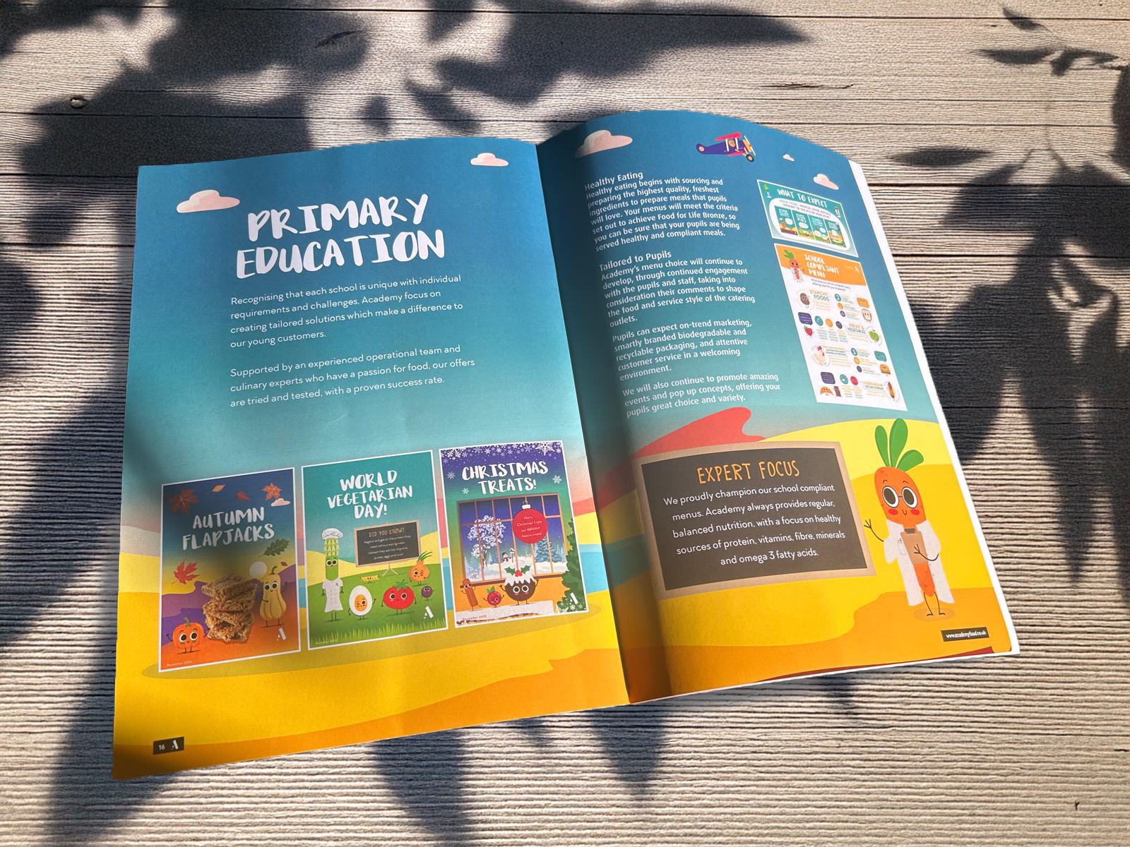
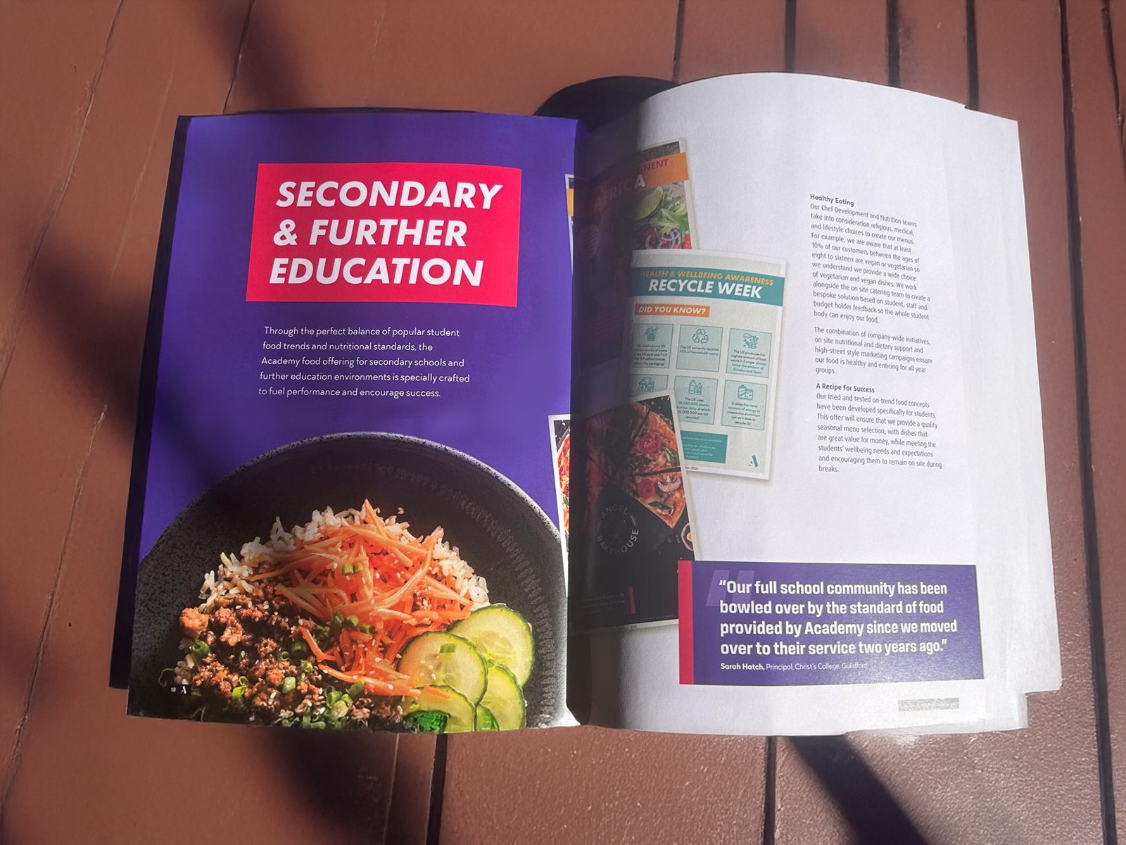
The rollout of this new brand spanned around 2 years. As the brand guardian, I oversaw and, at times, shaped the look and feel of site mobilisations. This involved close liaison with third-party companies and numerous operations managers to ensure the consistent application of the brand in Academy sites, particularly within the catering areas and across all marketing materials. We serviced a diverse range of clients, from "heavy hitters" like McCarthy & Stone to prominent educational institutions such as Bolton College (a large vocational and further education provider) and The City of Leicester College (a vibrant 11-19 secondary and sixth-form college). These examples highlight our capacity to serve very busy facilities, each with diverse educational offerings that sometimes demanded a bespoke and tailored visual approach. This occasionally required further site-based surveying and close collaboration with site and operations managers. We also supported public and private schools nationwide. You can explore examples of these projects here: (primary schools) and here (higher education & secondary schools). This meticulous approach was integral to our annual marketing strategy and implementation. While the core branding has largely remained consistent, particularly in primary school education, other facets of the brand continued to develop and evolve over time during implementation, a process shaped collaboratively by the senior design team and myself.
Ultimately, this fresh branding contributed to a significant uplift in sales and revenue, further bolstered by its crucial role in enhancing our ability to win new business tenders and contracts. It provided the polish and modern relevance necessary to secure new clients and expand our market presence. It has since been successfully rolled out to the vast majority of sites previously operating under the "Catering Academy" name, now unified under the "Academy" (food Co) brand.
Primary Schools


Secondary & FE Schools

Healthcare